jeThe client is running a icon / button / widget project on crowdspring
The client is offering $1,400 in awards.
The world's best entrepreneurs, businesses, agencies, and
nonprofits trust crowdspring for custom icon / button / widget needs.
Learn more about custom icon / button / widget
Here's the client journey on crowdspring:
1.The client completed an interactive design brief.
- The brief is customized for each project category.
- The client specifies what they want (and don't want).
- Simple and proven process (takes just a few minutes).
FAQs
"I loved working with crowdspring! It was so exciting to watch your project pick up steam as you gave feedback to the creatives. It felt very collaborative and you have so many creative people submitting ideas just for your project. Their system is organized, easy to use and understand. I am so happy with the results!"
 Ali Hissey, Founder, Hissey Fit
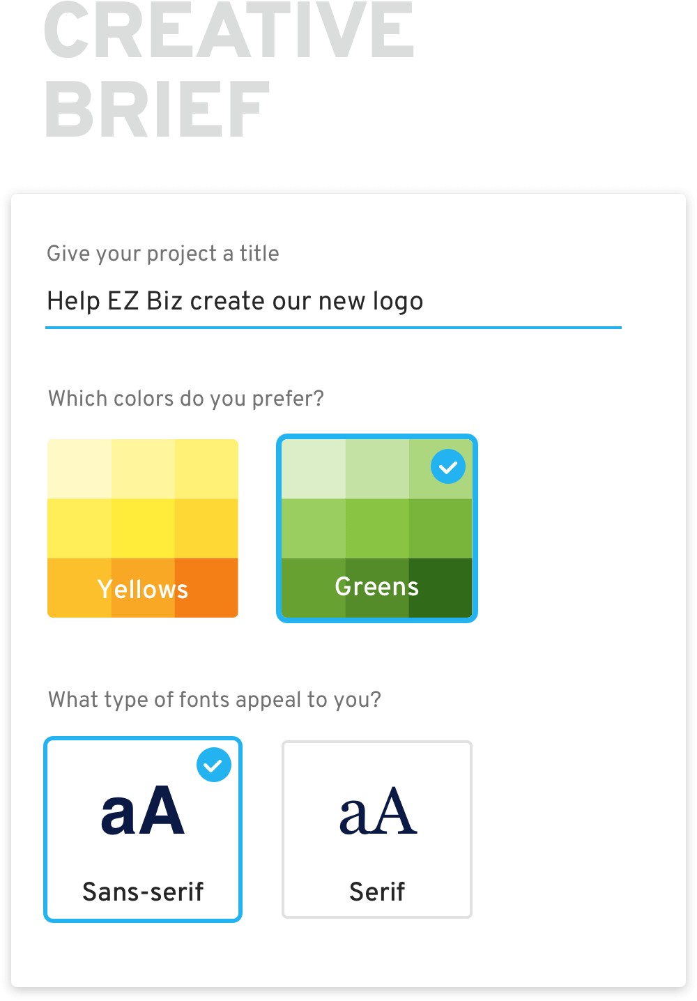
2.Our über-talented designers are creating dozens of unique designs.
In a typical icon / button / widget project on crowdspring, many professional designers submit dozens of custom designs based on your brief. See all designs submitted to this project.
- 220,000+ designers from 195 countries.
- The client reviews & gives feedback.
- Great collaboration tools & free focus groups.
FAQs
"In 10 years I have launched 17 projects on crowdspring and have always been impressed. Crowdspring brings 10 maybe even 100 times more creativity than simply working with a single random creative I could have found outside of crowdspring where I might only see a couple different concepts. And the price is very affordable."
 Steven Krane, Entrepreneur & Investor
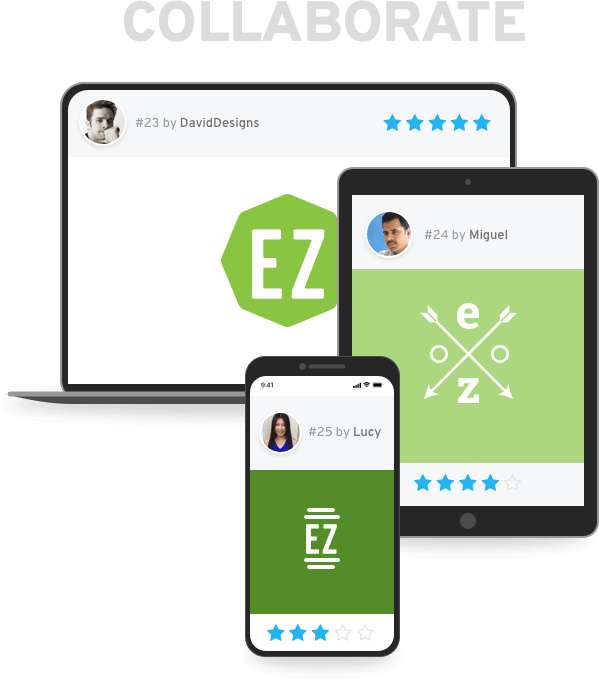
Have questions about custom icon / button / widget?
Get a free, no obligation design consultation3.The client will soon pick the winning design and receive final files.
After collaborating with multiple designers, the client will pick their favorite design, review proofs, request and receive tweaks, and approve final files. The client will receive high resolution final design files and a signed intellectual property agreement giving the client full ownership to the design.
- Collaborate with the winning designer.
- The designer will implement final adjustments.
- The client receives full intellectual property rights.
FAQs
"I just finished my 2nd of 3 projects with crowdspring. The first was an incredible book cover. This new project was artwork for a wooded token. I have a 3rd project on going for the development of a logo for graphic for my wife's jewelry business. I'll summarize - Don't waste your time at other sites - just come to crowdspring.com. The experience, the talent and the result will only make your life easier."
 Robert Dixon, Bob Dixon Consulting Services
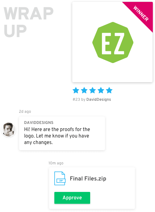
Grow your business with stunning icon / button / widget
Starts at $299 (including all fees)

by abu_hilmi