Book Cover Design
Book covers matter. A lot.
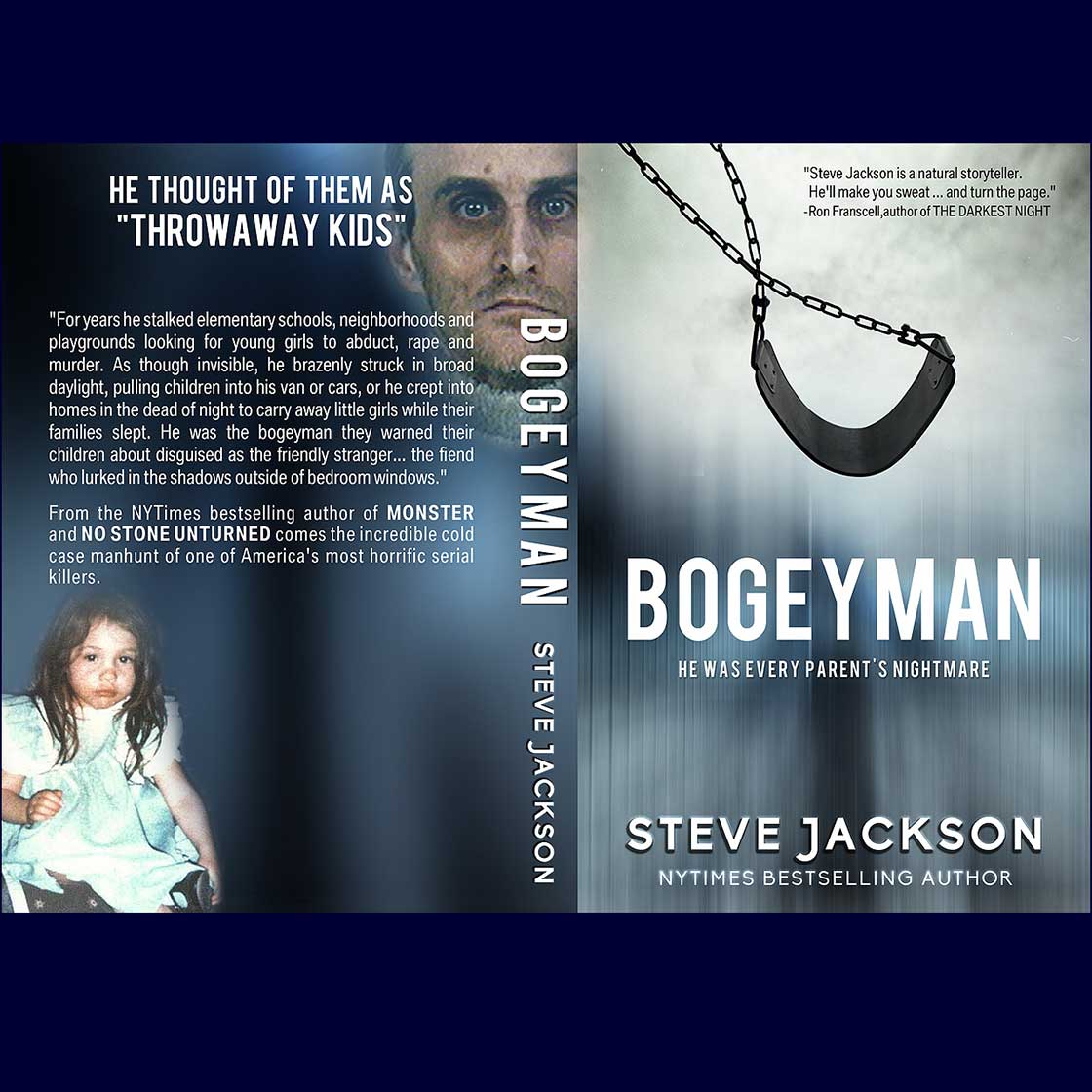
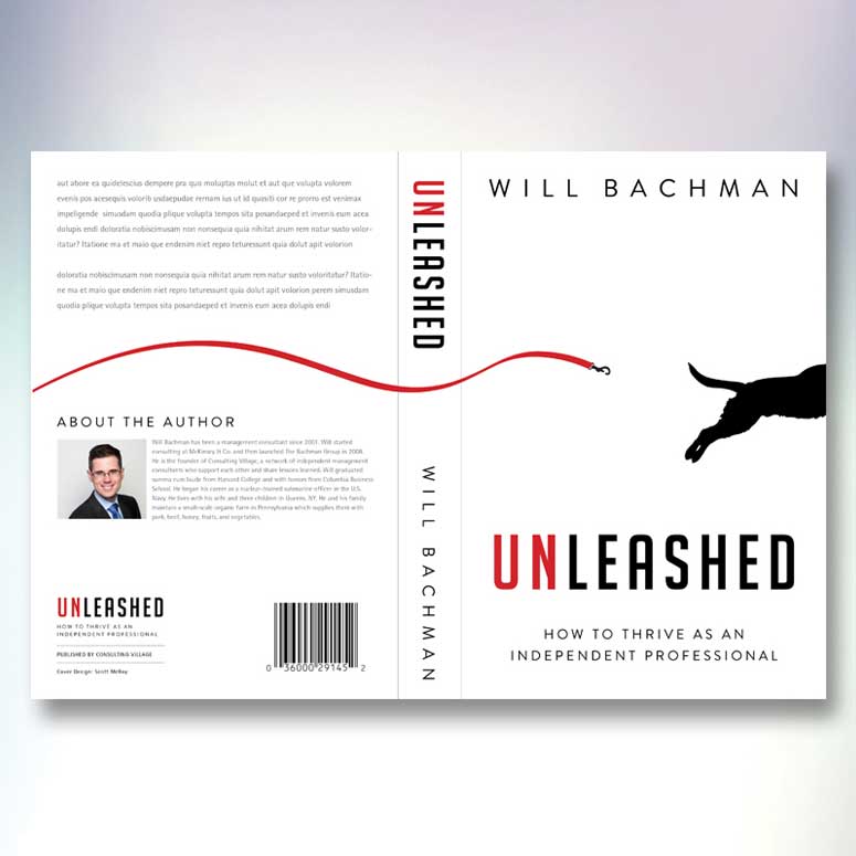
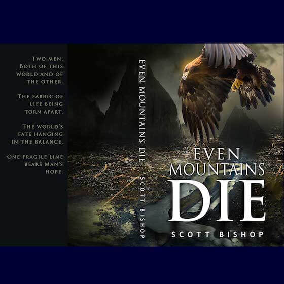
Designers from around the world will submit high quality cover designs for your book based on the criteria you provide, and you pick the professional book cover that best tells your story.
Why crowdspring is your best choice:
- 100% money back guarantee
- Dozens of unique designs in 7 days or less
- Original, editable design file
- Digital, print, web files (RGB, CMYK, PNG, JPEG, PDF)
- Award winning customer support
- Free legal contract protecting your intellectual property
- 220,000+ professionally screened and reviewed designers
Frequently Asked Questions
You should know the dimensions for the cover, any printing requirements, and what information will need to go on the front and back covers. The front cover typically includes the author's name, title, subtitle, images and sometimes a quote. The back cover may need an ISBN number, biography, and a quote. Every cover is different so think about what you’ll want to have on yours.
The best book covers have strong composition, a great focal point on the cover, clear title and subtitles, and a simple design. Every photo, image and word you include in the cover should reinforce the message you’re trying to communicate to the reader. It’s not surprising that best-selling authors don’t use free book cover design for their books. Sure, the book covers are free, but the books sit on a shelf or gather dust on Amazon. Generic book covers don’t help to sell books.
Especially today, when books are sold mostly online, you should avoid white backgrounds. White backgrounds disappear on a page, especially when shown as a small thumbnail. Use a color, a texture, or a background illustration instead.
Colors are important because colors create emotional reactions. The colors you pick should be connected to the story and mood. For example, a book best suited for the beach should consider incorporating cool blues and jade greens to give a tranquil feeling. Dramatic books should consider using black, bold red, and similarly dramatic colors to underscore the mood of the story.
Your book is about something, and the book cover design should reinforce that theme. Pick an element that takes control and reflects that theme. Avoid including too many elements in your cover.
Think of your book cover design like a billboard that you see on the highway. If the billboard has too many elements, you'll never be able to figure out what's being marketed. Billboards usually have a few words and are intended to quickly communicate to people driving 60 miles per hour. Make sure your cover does the same thing. What is the genre of your book? Can you feel the tone of the book through the cover?
We know that authors have different budgets and we want to be sure that everyone gets a phenomenal book cover design. We will make sure that you’ll get a great design regardless of pricing package. Having said that, higher awards to tend to attract more experienced cover designers and so you’ll have more high-quality designs from which to choose your favorite. And, of course, if you need some privacy in your projects, our higher priced packages offer private galleries, non-disclosure agreements, and more.
Yes, and in fact, this is very common. You might need more help with graphics and illustrations or the layout of your book. You can easily start a private 1-to-1 project with your favorite designer.
When you reduce the cover to a small thumbnail, can you read the title? Avoid using script fonts - those can be very difficult to read, especially when someone is seeing a thumbnail of your cover design.
Colors and a great image are critical to effective book cover design, but you also need text and an effective font that matches the cover and the story. For example, if your audience is mostly women, you might prefer fonts that have more feminine flairs, such as scripted fonts. But don’t go overboard – some fonts are easier to read than others. There are thousands of fonts and not all of them are clean and readable on a small screen. Use a simple typeface and be sure you’re not using many typefaces on the cover. It’s OK to use two fonts on a cover, but more than two fonts will make the cover look busy and less readable.
Look for imagery that expresses the mood or overall tone of the book. You want to provide a context, not a literal image.
And remember to focus on one main image. It’s tempting for some authors to get carried away by trying to represent all the symbolism in their story. But when it comes to book covers, less is definitely more. Remember that the cover will be typically seen as a small thumbnail and you want your reader to understand what they’re seeing. You don’t want to confuse or overwhelm the reader with conflicting or busy imagery.
While you may have three story lines, five characters, twenty scenes and several plot twists, pick one strong theme for the cover. Is there one constant to your story? One lesson? One value? One message?
Good design is about balance. Pick one constant and tell it visually through the cover design.
Yes. If you have specific images in mind, please include them when you post your project. You can also ask designers to use stock images (which you may need to purchase directly from a third party when you select the winning design). Designers will let you know whether you will need to do this, and the price, when they submit each design.
Crowdspring guarantees your satisfaction in book cover design projects. There's NO fine-print. We are not happy until you are. Authors are so thrilled with the designs they receive on crowdspring that we are proud to stand behind the work and make you an unconditional promise.


