5 Successful Rebrands and the Strategies That Worked for Them


Public awareness of company rebrands in recent years is high, and with good reason: a good rebrand can shed new light on a company, connecting it with consumers in new and effective ways.
Companies need to build a strong brand identity.
But brand identity is rarely permanent. You might envision building a lasting brand when you write your business plan, but nothing lasts forever.
Culture and markets evolve. Brands also evolve.
And sometimes, a rebrand is the only way to push the brand forward and make it relevant again.
Most rebrands change only the visual branding elements and leave the brand name. But sometimes, you also have to change the business name to reflect your current brand.
When rebranding, no one wants their rebrand to become the next headline or subject of public ridicule like the brands we discussed in 5 Major Rebranding Failures and What You Can Learn from Them.
Here are examples of five brands that used proven rebranding strategies to rebrand successfully.
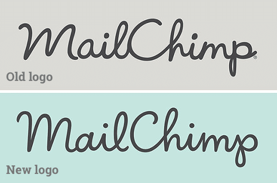
Mailchimp – The design is in the details
We tend to notice significant redesigns and rebranding disasters, but sometimes minor tweaks and restraint are more effective.
Taking stock of what’s there, optimizing it, and then distilling it is often a better strategy than a complete overhaul.
Mailchimp is a web-based email marketing service that is used by, in their words, “more than 15 million people and businesses around the world.”
Its features and integrations allow marketing emails, automated messages, and targeted campaigns to be sent out to customers, with detailed reports to track progress.
Designer Jessica Hische covered every little change in her post about the redesign.
For a rebrand that was all about the details, this was rather fitting. “They just wanted a facelift—one of those classy facelifts that make your friends ask you if you’ve been sleeping better lately or lost some weight because you look like a more vivacious version of yourself and not like a different person.”
The subtle evolution was not missed by those in the know.
Leading design website Brand New raved that it was “[A] Fantastic evolution that maintains the character of the original with enhanced performance,” and Design Taxi called it a “subtle but refreshing makeover.”
Rebranding strategy:
If your current branding works for you, don’t mess with success. Consider improving and tweaking what you already have to make it more precise and more refined.

Kodak – Going backward can move you forward
Sometimes subtle changes are all you need.
At other times, a dramatic reboot is needed.
After the lamentable death of film, Kodak had almost completely disappeared from the consumer market, finding most of its success in large-scale printing systems and the enterprise market.
Kodak’s first rebrand since 2006 heralded its return to selling directly to consumers.
“I don’t think of what we’re doing as ‘bringing back’ the iconic identity of Kodak, because in people’s hearts and minds, I don’t think it really went away… The latest iteration needed to feel fresh, yet classic, yet sit harmoniously alongside a range of logos that you still see on signage and packaging around the world. Our goal is to amplify what is already memorable and resonant around the world.” – Steven Overman, Kodak Chief Marketing Officer
Kodak sought to embrace its rich tradition with its updated logo.
New York, NY-based design agency Work-Order wrote about the rebrand goals:
We seek a dialogue about honoring a legacy and letting a company rebuild with integrity and dignity.
Kodak didn’t want to toss out its iconic brand for something foreign and instead chose to incorporate the company’s storied history into its new design.
The results were met with acclaim. Under Consideration described the new logo as:
a great redesign or reboot or restart or whichever way this wants to be positioned. It capitalizes on the current acceptance of nostalgia by bringing back a classic icon and it builds on it with a simple, confident aesthetic.
It was a savvy strategy for Kodak to evoke their original branding in the redesign. By including its instantly recognizable color scheme into its rebrand, Kodak was able to keep their company’s legacy at the forefront of its customer’s minds.
Rebrand strategy:
Sometimes looking to the past can help you update for the present. Using visual and design cues from your company’s history can help make your new logo design more relevant. This isn’t a good strategy for people who just started their business but works for established brands.
Google – Be mobile, consistent, and cross-platform friendly
Updating for the present may be an essential part of your goals, but thinking about the future and the longevity of your rebranding efforts is vital, too.
Google’s redesign of their ubiquitous multicolored sans-serif logo was highly publicized and roundly criticized when it was first released.
The web was flooded with people carping about how terrible the new logo was, but Armin Vit’s review was clear and prescient:
The official, short verdict from me is that this is great. Really great. It’s not a groundbreaking logo but it doesn’t need to be. It’s the system and cohesive thinking about it that stands out and may be hard to get excited about for the general public.
The logo redesign capped off a year of transformation at Google, including introducing the Material Design system used in its Android mobile operating system and across all of its apps.
Google has been reinventing itself to meet mobile devices’ challenges, and the logo redesign was part of this process. Google reaffirmed this in their original announcement of the redesigned logo, saying “our brand should express the same simplicity and delight they expect from our homepage, while fully embracing the opportunities offered by each new device and surface.”
Google’s redesign honored the character of its original logo and managed to push it into the future; this was a notable success of incorporating existing history into your brand’s strategies for moving forward.
Rebrand strategy:
Think about where this redesign fits your entire branding system, and make sure you consider cross-platform and future usage possibilities.
Airbnb: embrace your critics and roll with the punches
Here’s a warning: many of the links in this section about Airbnb’s rebranding are “not safe for work,” but what else could you expect from a rebranding that was likened to a ‘sexual rorschach test for our time‘? That rebranding was Airbnb’s 2014 release of their infamous “Bélo.”
Airbnb’s original goals for the new logo were lofty:
It’s a symbol that, like us, can belong wherever it happens to be… It’s a symbol for people who want to welcome into their home new experiences, new cultures, and new conversations. We’re proud to introduce the Bélo: the universal symbol of belonging.
The reaction was swift, and as is the way with the internet, vicious, with Gizmodo ridiculing:
The “Bélo” (NOT MAKING THIS UP), as Airbnb refers to the mark “internally” (NOT MAKING THIS UP), is supposed to reflect the “hierarchy of decisions” that users make when booking a place to stay. But for most of us, it just reflects genitalia.
The new icon trended on Twitter for eight hours and was mocked and parodied mercilessly.
Airbnb cleverly anticipated the reaction to the new brand, creating a microsite allowing people to develop their versions of the Bélo, called Create Airbnb.
Airbnb’s bold attempt to welcome mashups and personalization of their brand was not missed by many, including Andrew Leonard from Slate proclaiming:
Who cares what it looks like? Airbnb’s new logo is pure genius. If Airbnb’s goal was to get people talking about Airbnb, then this campaign is pure genius, and can only be considered a massive success. The sheer velocity of the snarking is a sign that Airbnb, like Apple, plays an important role in our emerging culture.
Brand Union’s creative director Sam Becker had a similar reaction to how Airbnb handled the launch of their rebrand:
So far, Airbnb has done an excellent job responding to these observations with light-hearted acknowledgment. They’ve also continued to back the brand with confidence. Showing any weakness at this point would be tantamount to giving up.
Knowing how to work criticism into your branding efforts with humor and grace is an excellent strategy for turning a potentially harmful situation into a positive and memorable experience.
Rebrand strategy:
Have a plan for how you’re going to respond to your rebranding efforts, and try to anticipate and integrate criticism and comments into the overall branding story you’ve created.
Mozilla: Open by default
Newton’s third law states that “for every action, there is an equal and opposite reaction.”
Newton was probably not talking about logos and design, but he might as well have been.
As every rebrand we’ve looked at here shows, the public response to a redesign can be highly varied. You can easily find opinions both for and against almost any redesign.
Web browser pioneer Mozilla’s rebranding didn’t just anticipate the inevitable criticism. Their entire process was built on the input and critiques of their community.
Kicked off in June of 2016 by Mozilla and London, UK-based brand consultancy Johnson Banks, the entire process of redesigning Mozilla’s brand was done publicly and in the open.
The result of this unprecedented public collaboration was Mozilla’s new logo.
Many high profile design thinkers thought it was a success, including ex-NYT’s creative director Khoi Vinh, who remarked,
My first impression was that this is a bit of a groaner—the visual pun struck me as the tech/design equivalent of dad humor (as a dad myself, I should know). But it didn’t take me long to warm up to it. I’m a fan of its utter lack of pretension, and how unabashedly it embraces the organization’s geeky legacy. Overall, thumbs up.
Brand New’s Armin Vit had an equally effusive response:
Overall, it’s amazing that this open process that actively requested and implemented feedback from hundreds of people led to a logo that not only DOESN’T suck but one that has a strong idea, a fresh execution, a promising flexibility, and, that all of it together, sometimes subtly and sometimes overtly, manages to communicate what Mozilla is about. Power to the peop/e!
Rebrand strategy:
While not every organization can do what Mozilla did, incorporating feedback from your target audience and customers is something every successful rebranding effort should do.
A good redesign for your company is a challenge, but with a thorough evaluation of what your brand represents and how you want to reflect that best, it’s not an impossible one.
Keeping what’s working for you already, a flexible attitude toward criticism, and good communication with your customers and prospects can help you achieve your branding goals.
Design Done Better
The easiest way to get affordable, high-quality custom logos, print design, web design and naming for your business.
Learn How to Grow Your Business With Beautiful Design


